
Helping Nonprofits Peek into the Future
A Story About Outlier Detection
An important part of our mission is to support nonprofit organizations with real good data science. This summer, I’ve been working on a revenue prediction tool for nonprofits. The goal? To provide a free and simple-to-use tool that helps nonprofits plan how much revenue they should expect in the next year or two. I’ve been working with the National Center for Charity Statistics (NCCS) CORE Series dataset, which includes financial information from over 1 million U.S. nonprofits over the span of 3 decades based on publicly available IRS data (990 form). Working with big data is not easy because real-world data is messy. It comes from multiple sources, has missing information, can contain errors and unexpected features. The NCCS is an organization focused on maintaining this dataset and did a lot of heavy lifting (for which I am very, very grateful) by putting all of the relevant data into one place with detailed documentation. Even so, it took about 2 weeks to tidy up the data and make it usable for analysis. This process left us with a huge dataset containing more than 8 millions records from over 700,000 nonprofits across 33 years.
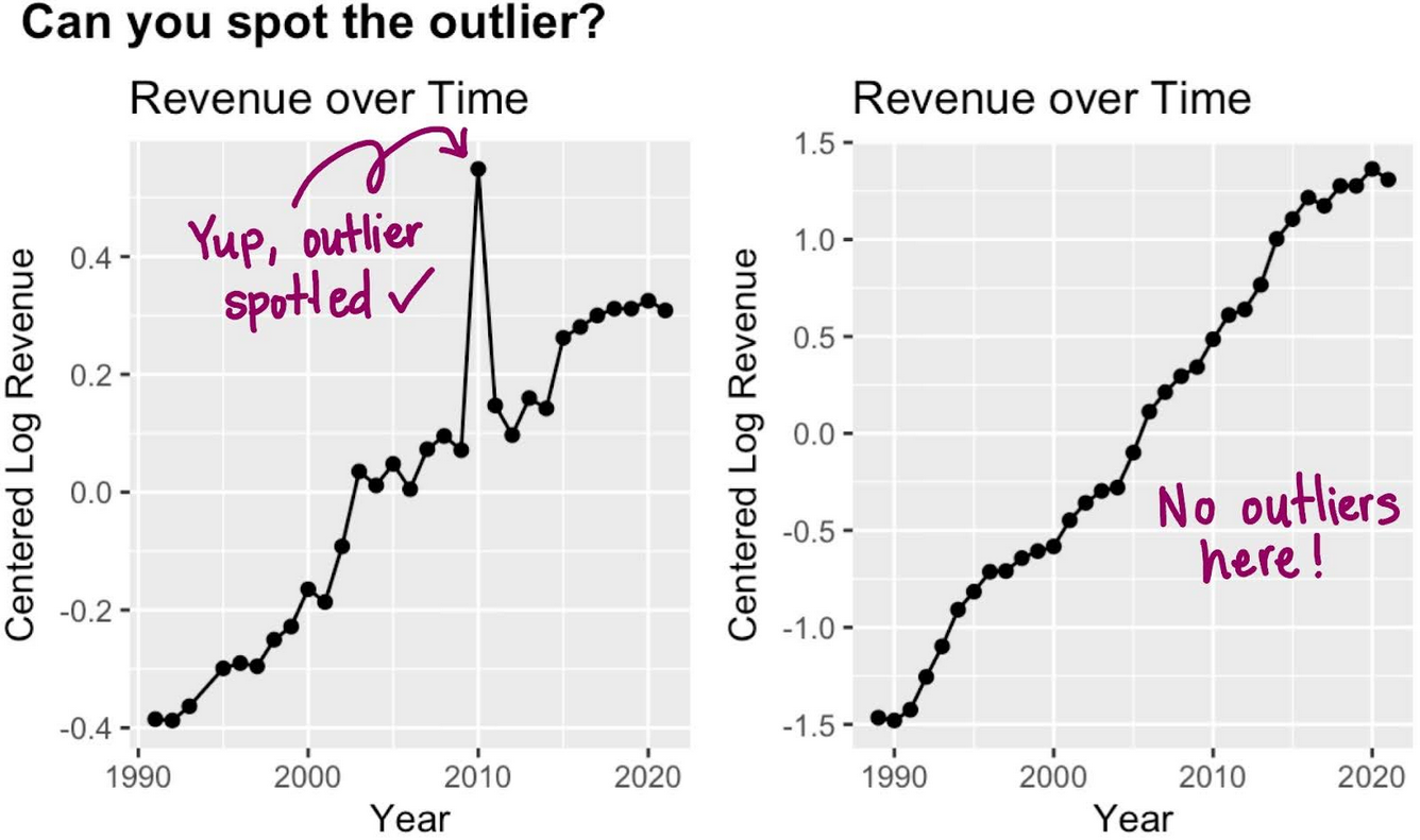
With clean data in hand, we turn to modeling! Our goal is to learn patterns in the data well-enough to be able to predict, with some measure of confidence, the future (i.e. next year’s revenue). Think of it like learning a morning routine: if I know that you go to Starbucks on your way to work almost every day for your morning pick-me-up, I might be able to guess where you will be at 8am next Tuesday. Depending on how strong your routine is, I can guess confidently and will most likely be correct. But what if something unexpected happens, like your kid wakes up sick and it's too late to find a babysitter? No Starbucks for you this morning :( Or in the case of nonprofits, the COVID-19 pandemic hits the U.S. leading to unprecedented shutdowns and disruption, or a wealthy donor makes a large one-time donation to your organization. This causes a break in the pattern, something I didn’t anticipate. These types of unexpected, extreme deviations from the pattern—outliers—can confuse a model and lead to inaccurate predictions. So what do we do? Something cool about us humans is how we can look at something like Figure 1 and quickly tell that the left plot contains an outlier in 2010 and the right plot contains no outliers. But going manually through these plots for 700,000 organizations is infeasible… assuming it takes a human 30 seconds to look at a plot, identify outliers and record them, it would take me three years, assuming 40 hour work weeks the whole time. Yikes–ain’t nobody got time for that!
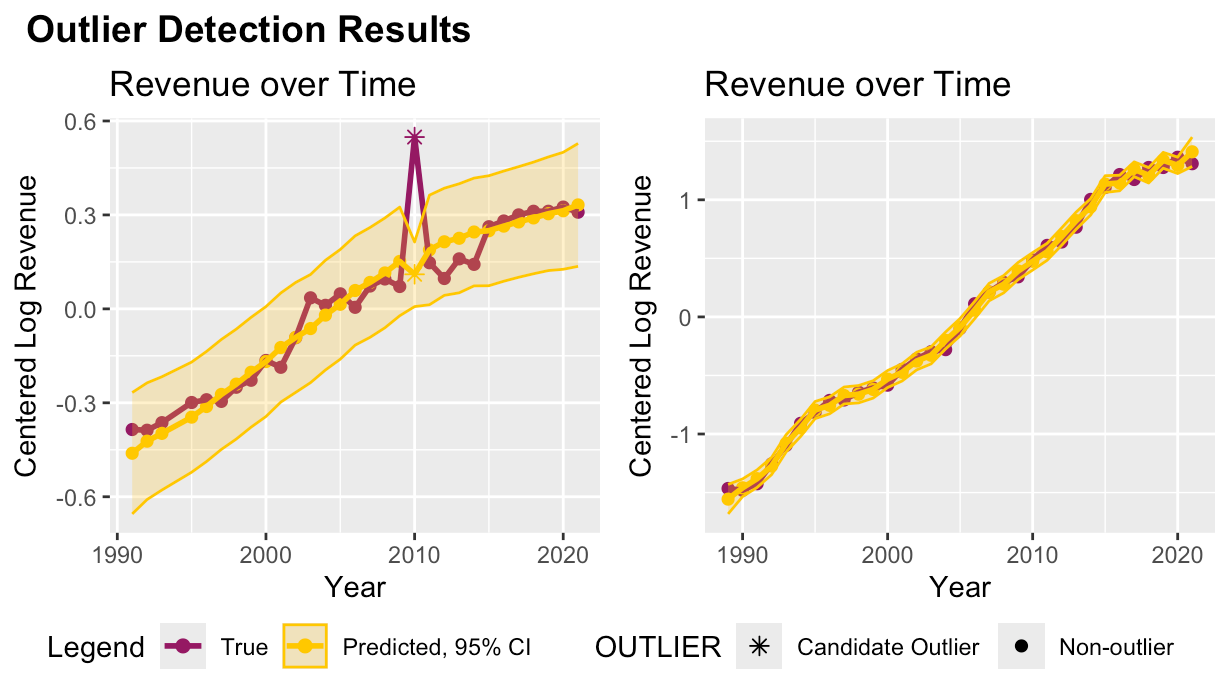
This is where the math modeling comes in to save the day! The idea is still what we as humans do: look at the overall pattern and look for anything that veers too far off, only in this case the process is not visual and instead relies on some cool math! We used Gaussian Processes, a type of model that comes with built-in tools for determining how confident you can be in the model’s predictions that can flexibly fit any shape an organization throws at it. To get the best results, we combined this with some model optimization. We tried some classic optimization methods like grid search (ooooo), where you make a bunch of guesses in the hopes one is good enough, and some fancier methods like Bayesian Optimization (ahhhh), where you actually use a different model to help you find a better model. Don’t worry, I didn’t know what Bayesian Optimization was either until I had to do it! We got decent results with gradient descent, a classic and popular optimization method where you use extra (gradient) information about a point to find a good model, but it was still too slow: 20 seconds per org, or 5 months of nonstop computation. Better than 3 years, but still impractical. With a few more tweaks, we found we could group similar organizations and fit them together, which got down to a computation time of a tenth of a second per organization… less than 24 hours of computation time! From three years, to 5 months, to 1 day–that’s the power of math and technology to increase efficiency. Imagine if we were able to speed everything up that much! See for yourself below!
Overall, our strategy identified 218,885 records as outliers (remember, our original dataset has over 8 million records). You can see the proportion of records each year identified as outliers (positive and negative) in the plot below. Most years, less than 4% of records are identified as outliers, but in 2020 and 2021 those numbers jump to over 6% (surprise, surprise).

Even though outlier analysis isn’t the main goal of this project, it’s still pretty cool to have numbers to analyze regarding outliers. But the story isn’t over yet… Now we’re doing the most fun part: model training and selection. Stay tuned for next time, when you’ll get to see the final product.

